The Matching Outfit Myth: Coordination Need Not Mean Identical
Matching outfit coordination can feel polished without duplicate pieces. Learn to link clothing and accessories through colour, texture and scale with ease.
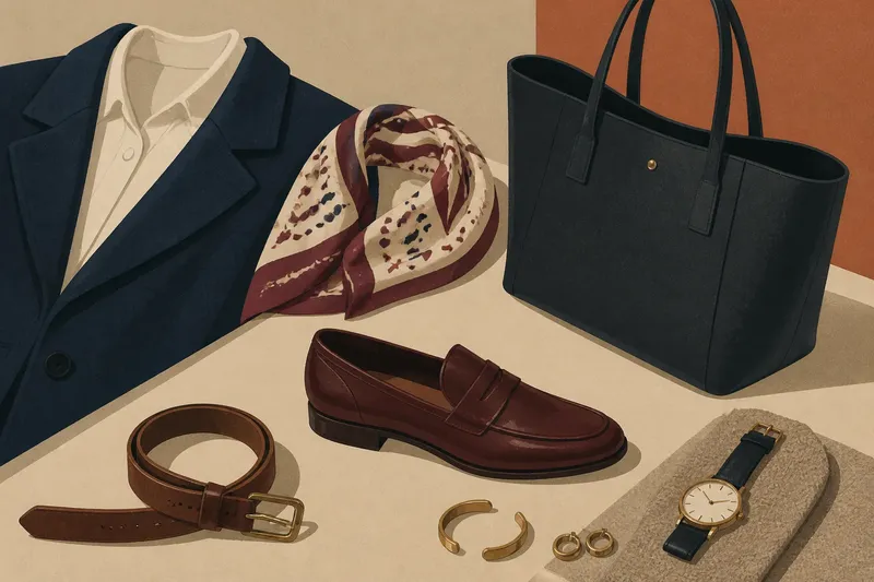
The most common matching outfit mistake is buying a bag, shoes and belt in one exact shade, then finding the result looks more like a boxed set than a personal outfit. Matching outfit coordination works better when pieces connect through their roles and details, rather than repeating the same colour, texture and shape all at once.
Why can matching accessories look like a set?
When several items share the same colour, finish and visual weight, they read as a group. That can feel neat, but it leaves little room for each piece to show its character. The issue is not matching itself; it is making every match equally prominent.
Keep one exact match and vary the rest. If a tan leather belt and loafers are close in colour, a deeper brown bag or a canvas tote gives the outfit another note. You can also match just the bag and shoes, then let the belt differ or skip it altogether.
Think about what each accessory is doing. A belt marks the waist, shoes ground the outfit, and a bag carries its own shape and visual weight. Coordination feels natural when those roles work together, even if the pieces are not near-duplicates.
How can colour echoes feel intentional?
A colour repeated only in tiny, isolated details may look accidental: a small button, for instance, has little visual company. Instead of searching for an exact shade match, choose a second piece where the colour is noticeable enough to register, such as a scarf with a coloured border or a bag with a contrasting panel.
Repeating a colour in items with different functions helps prevent a uniform effect. A navy jumper and a blue detail in a printed scarf can relate without looking like a set. If the shades differ, let the rest of the outfit stay simple so the connection is easy to see.
Say you are wearing charcoal trousers and a cream shirt, and want to wear burgundy loafers. You could choose a scarf whose small print includes burgundy, rather than seeking a matching belt and bag. The shoes and scarf would share a recognisable note, while their different patterns and positions would keep the outfit from feeling packaged.
Can materials connect an outfit better than colour?
Materials can share a feel without sharing a shade. A suede shoe and a woven bag, for example, both have a soft, tactile surface, while still looking distinct. This is useful when colour matching feels too precise or when your outfit already contains several colours.
Pay attention to how finishes catch the light. Satin reflects it sharply, while brushed wool softens it. Several glossy accessories can make an outfit feel more formal or visually busy, so let one polished item stand out against quieter fabrics.
Also consider how surfaces sit together. A patterned scarf and a nubby coat might compete if both draw the eye. Keep one more subdued, or let a plain collar show between them. There is no need to match every texture; one shared quality is enough.
How do accessories relate through shape and scale?
Accessories can connect through their visual weight rather than their colour. A substantial bag may feel at home beside a broad coat, while a fine chain can sit comfortably with a delicate neckline. These are cues, not rules: a tiny bag can stand out against a large coat if that contrast is the point.
Look at the accessories together, not only at each one in isolation. A narrow belt, fine jewellery and small shoes can make a bold, structured bag feel like the outfit’s only substantial element. You might swap one smaller accessory for a broader cuff or a more structured shoe, or keep the bag as the focal point and leave the rest quiet.
Imagine you have a soft navy coat, narrow black shoes and a small black shoulder bag, but the bag seems to disappear beside the coat. Starting with those pieces, you could replace the small bag with a structured black tote while keeping the shoes unchanged. The resulting decision is clear: if the tote makes the accessories feel more balanced, keep it; if it overwhelms the coat, return to the smaller bag and let its compact shape be a deliberate contrast.
What questions help you connect separate pieces?
Why do my shoes look separate from the rest of my outfit?
They may be the only dark or highly polished item, so the eye stops there. Echo a small detail elsewhere, such as a dark bag or a similar finish, rather than trying to find an exact shoe match.
Can different shades of the same colour work together?
Yes, if their undertones feel compatible and the materials offer some contrast. Place them side by side in the light where you will wear them; if one looks distinctly cooler or warmer, choose a different echo or let a neutral item sit between them.
What if a print clashes with my accessories?
Choose one quieter colour already present in the print and repeat it in a plain accessory. If the print is busy, a simple bag or shoe usually gives the eye more breathing room than another prominent pattern.
How many matching details should an outfit have?
There is no fixed count, but one clear echo is often enough to connect separate pieces. If several items already match in colour and finish, let one garment or accessory bring in a different material or shape.
What is not worth the effort?
Trying to make every leather item, metal fitting and fabric dye look identical is usually more work than the outfit needs. Materials reflect light differently, so an almost-match can look fussier than a deliberate contrast. Pick one connection the eye can recognise, then leave the rest alone.
For matching outfit coordination, start by asking what each piece contributes: a colour echo, a distinct surface, or a useful contrast in shape. If two items already feel related, there is no need to add another match. That leaves room for accessories to work together without making them look as though they came from the same set.