Rust Beside Rose: Two Ways to Pair Warm Colours
Pair rust and rose through tonal depth or clear contrast, and use colour placement to shape an outfit that feels balanced without forcing a fixed palette.
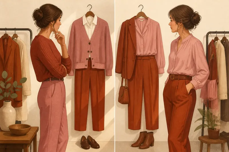
The easiest mistake with rust and rose is to assume that warm colours will automatically sit together. A dusty pink blouse beside a bright orange-leaning rust skirt can look accidental rather than harmonious; the cost is an outfit that feels harder to wear, even when both pieces are favourites. Pairing rust and rose works better when you decide whether you want their shared warmth to blend or their differences to show.
Imagine you have a muted rose cardigan and a rust-coloured pair of trousers, but the combination feels uncertain on the hanger. In this invented situation, you try two versions: one built around similar colour depth, the other around a deliberate difference in lightness. The garments stay the same. What changes is the amount of contrast, where each colour sits, and how much of each the eye encounters.
What does a tonal rust and rose pairing look like?
A tonal pairing brings the colours together through a related level of depth and softness. It does not mean that rust and rose must be nearly identical. Rather, neither should shout over the other. A muted, clay-like rust can sit comfortably beside a subdued rose, particularly when both have a softened, earthy quality.
In the imagined outfit, you start with rose trousers and a rust knit. The rose is deeper than pale blush but not so vivid that it reads as fuchsia; the rust has a brown undertone rather than a strong orange one. Because the colours have comparable visual weight, the outfit reads as considered and calm. A cream shirt at the neckline can separate them gently without turning the look into a three-colour formula.
Texture helps tonal colours remain distinct. A ribbed knit, brushed wool or matte cotton catches light differently from smooth twill or satin. That difference gives the eye something to notice even when the colours themselves are close in intensity. You need not add a conspicuous pattern or another bright shade to make the combination interesting.
Try tonal dressing when you want the outfit to feel settled: for a long day of errands, a relaxed office setting or a meal where you would rather not have your clothes speak before you do. The point is not that tonal colour is inherently more elegant. It simply lowers the visual volume and lets shape, texture and accessories carry more of the personality.
How does contrast change the effect?
Contrast-led dressing makes the difference between rust and rose part of the outfit’s character. One colour might be light and soft while the other is dark and saturated. The combination then feels more deliberate, with a clear focal point and a stronger sense of energy.
For the second version of the imagined outfit, keep the rust trousers but swap the muted rose cardigan for a light, clear rose blouse. The contrast between the pale top and deeper bottom draws attention upwards, while the rust anchors the outfit. If the blouse is especially bright, a rust jacket or belt can repeat its warmth near the face and make the pairing feel connected rather than split in two.
Contrast can come from more than lightness. A brown-based rust beside a cool, blue-leaning rose may create tension through undertone; a vivid rose beside a subdued rust creates contrast through saturation. These differences can be appealing, but they become harder to read when every feature competes at once. If the colours differ in depth, temperature and intensity, keep the rest of the outfit simple enough for that choice to make sense.
This approach can suit a day when you want colour to be noticed: a gallery visit, a casual gathering or a plain outfit that needs one confident focal point. There is no need to make the colour contrast louder with statement jewellery, a busy print and another vivid accessory. One strong relationship is usually easier to wear than several at once.
Where should each colour sit?
Proportion changes the balance even when the colours stay fixed. A large area of rose with a small rust detail will look different from rust trousers with rose limited to a scarf. Consider which garment you want people to notice first, then let that colour occupy the more prominent area.
In the invented walk-through, the rose cardigan covers more of the outfit than a small accessory would. The rust trousers still matter, but they act as a grounded base. When you replace the cardigan with a rose neck scarf, the rust becomes the dominant impression and the rose a brief accent. Neither version is more correct; they tell different visual stories.
Placement also affects how the colours meet. A shirt tucked into trousers creates a crisp boundary, while an open cardigan lets a strip of the colour beneath it appear gradually. A coat, longline waistcoat or scarf can interrupt that boundary and bring the colours together in smaller intervals. If the meeting point feels abrupt, a neutral layer such as ivory, chocolate brown or soft grey can provide a pause.
Think about the garment’s shape as well. A broad block of bright rose may draw more attention than the same shade in a narrow collar or bag strap. Pattern changes the proportion, too: a rose print on a rust ground makes rust dominant, while rust motifs on rose cloth reverse the emphasis. These are useful choices when one colour feels lovely near your face but overwhelming in a larger area.
What can you adjust if the pairing feels off?
In the hypothetical outfit, the first attempt looks too flat. Instead of abandoning the colours, you change the rose top for one with a little more depth and choose a rust belt that repeats the trousers’ tone. The expected visible result is a clearer outline between the two colours, with the belt helping the upper and lower halves feel related.
If the combination looks too stark, soften one colour rather than altering everything. A rose scarf in a dusty shade may ease a vivid rust jacket; a subdued rust skirt can temper a very clear rose shirt. You could also add a light neutral at the collar or a dark neutral in the shoes. Small adjustments let you find out whether the discomfort comes from contrast, proportion or the colours’ undertones.
- Check depth: Ask whether both shades are muted and similar in visual weight, or whether one clearly leads.
- Check undertone: Compare the fabrics in daylight to see whether the rust leans brown or orange and whether the rose leans peach, purple or blue.
- Check proportion: Notice which colour covers the largest area and whether that matches the effect you want.
- Check the boundary: Try the top tucked in, worn open or separated by a neutral layer.
- Check texture: Use a matte fabric beside a textured or slightly lustrous one if two close shades feel flat together.
- Check the finishing details: See whether shoes, a bag or jewellery repeat a colour naturally, rather than adding a new shade that distracts.
Not every mismatch deserves solving. There is little value in searching for a perfectly matched rust bag if the outfit already feels complete, or buying another garment simply to bridge two colours. A useful first move is to change one existing piece’s placement or proportion and see whether the whole combination becomes easier to read.
Which rust and rose questions come up most often?
Can rust and rose work in a print?
Yes, if the print’s background and scale suit the effect you want. A small rust motif on rose fabric keeps the look light, while a rose motif over a rust ground makes the pairing feel deeper and more anchored.
Do rust and rose have to share the same undertone?
No. Related undertones can make a tonal pairing feel cohesive, while different undertones create contrast. If the difference seems uneasy, repeat one of the colours in a small detail or introduce a quiet neutral between them.
Which colour should I wear near my face?
Choose the one you enjoy seeing closest to your face and feel comfortable wearing. If you are unsure, hold each garment near your face in natural light and notice which makes the overall outfit feel more like you; there is no universal rule about rust or rose.
Can I pair rust and rose with another colour?
Yes, but a third colour changes the balance. Ivory can create a gentle break, dark brown can reinforce the earthy quality, and navy can make the warm shades feel more distinct; try one supporting colour before adding several.
How does the finished outfit change?
In the invented case, you settle on the rose cardigan, rust trousers and cream shirt, with the shirt visible as a narrow layer. The result is not a prescribed palette but a tonal arrangement with enough separation to keep each garment legible. On another day, the same trousers with a brighter rose blouse would make contrast the main event. The choice depends on whether you want quiet continuity or a more noticeable colour meeting.
That is the useful lesson of pairing rust and rose: adjust depth, proportion and placement before deciding the colours cannot work together. If you are searching for rust and rose outfit ideas, begin with the garments already in your wardrobe, decide which colour should lead, then make one change at a time. The most convincing pairing is the one whose balance suits the clothes, the occasion and the way you want to feel in them.